Wednesday, 19 October 2011

Assignment Bank 3: Print (Magazine) - Survey Results.

All of the people that answered this question said that they were interested in fashion magazines, 6/8 people said that they were interested in gossip magazines, 1 /8 said that they liked sport magazines and another  1 person said they were interested in food magazines.


4 out of the 8 people that answered this question said that they normally buy a magazine every month, 2 of the 8 people said that they buy a magazine every week , another person said that they buy a magazine every 2 weeks & 1 more person said that they buy a magazine every 3 weeks.


7/8 people that answered this question said that they usually pay around £2-£3 for a magazine and 4/8 said that they would usually spend around £1-£2.


This question was multiple choice (multiple answer ) , 7/8 people would like to see more fashion in magazines, 5/8 people said that they would like to see more of healthy eating in magazines, 5 people said that they would want to see more gossip in magazines, 4/8 people said they would like to see more celebrities in magazines, 1 person said that they would like to see more of sport in magazine and 3 people chose other, which means they would like to see more of something else in magazines.

This question, like the previous was multiple choice (multiple answer), 6 people said that they have purchased OK! In the past, 4 people said that they have purchased Reveal in the past, 4 people said that they have purchased heat in the past, 5 people have brought Now in the past and 3 people said that they have purchased Vogue before.
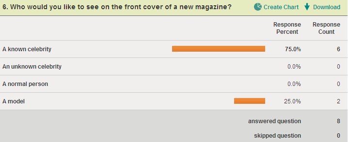
6 out of the 8 people that answered this question said that they would like to see a known celebrity on the front cover of a new magazine, but the other 2 people said that they would like to see a model on the front cover of a new magazine.

6 out of the 8 people that answered this question said that they would like to see the new magazine being purchased once a week; the other 2 out of 8 people said that they would like to see the new magazine purchased monthly.


This question was multiple answer, 1 person said that they would like to see stationary being purchased with the new magazine another person said they would like to see stickers being purchased with it. 5 people said that they would like to see nail polish being purchased with this new magazine, 3 people said that they would want lipstick or lip gloss to be purchased with the magazine, and 4 people said that they would like something else to be purchased with this new magazine.

Wednesday, 12 October 2011

Assignment Bank 3: Print (Magazine) - Analysing A Two-Page Spread.

In this two page spread, the language that is used is very informal; this shows that the audience is aimed for teenagers. The language used makes the reader feel comfortable and brings a sort of connection with Tulisa. This is an important factor because doing this helps to bring attention to reader, and will make them want to move on. The interview comes across as a conversation between the interviewer and Tulisa. Non standard phrases such as ‘you can’t really’ have been used by Tulisa, which shows that Tulisa can be herself and don’t have to be professional. How is colour used In the two page spread, the colour that is used is very moderate, there’s not as much pink as there is on the front page therefore it doesn’t seem as loud as the front page. The way in which the text has been laid out on the page shows Tulisa’s slightly longer responses, and the questions being asked.  You can clearly see the interviewers questions as they are in bright pink, (this goes with the layout), and Tulisa’s answers as they are underneath the questions. Out of the ‘triple’ page spread, only one page is occupied by an image and the other 2 pages have smaller images and a lot of text. This shows the importance of this interview and why Tulisa was placed on the front cover. The tone that the magazine has used is very informal, it’s calm and relaxed. It allows the reader to connect with the interviewer and Tulisa (the interviewee) because the words used are clearly informal; it shows that the conversation is almost spontaneous because of the way Tulisa responds to the questions. The interviewer clearly gets a lot out of Tulisa so you wouldn’t have to have that much knowledge about Tulisa.

Wednesday, 28 September 2011

Assignment Bank 3: Print (Magazine) - Analysing the contents page.

On the contents page the information is quite jumbled. The main story in the magazine is placed in the middle of the contents page. This is, like the cover page, about Tulisa Contostavlos and the X Factor, this time she is with her fellow judge Kelly Rowland. You can see clearly that this is the main story as it has the biggest image and the most text, and also the page number is the biggest one on the contents page. The rests of the page numbers are at the bottom left hand side; these also include a little text to tell you what that certain page includes. Also there is some more information about other stories included in the magazine and an image with each one, you able to tell quite clearly that they are also top stories as there page numbers are quite big too. This tells us that the magazine is going to be quite wild & messy and fun, this is because the contents page is very bold. There are promotional features included in the contents page, these are posters. There are 10 posters included somewhere in the magazine.  The logo/name of the magazine is placed at the top right hand corner of the contents page. It’s not very big but you are able to see it easily.

Assignment Bank 3: Print (Magazine) - Analysing a Magazine Cover.


We love pop, is a girly magazine, it mainly about gossip, fashion and boys.  The target audience for this magazine is pre teens and teenage girls. From the ages 12/13-16. Girls from this sort of age group are usually interested with fashion, boys and of course the latest hot gossip. The central image is an ‘X-Factor’ judge, and is also a member of ‘N Dubz’ Tulisa Contostavlos. She gives off a direct mode of address; she does this by staring directly at the camera. This will get the audience’s attention, and allows a connection to be made with the reader. It allows attracts the reader’s attention as she is a new judge on the X Factor, most people, including children, teenagers and adults enjoy this show and already know Tulisa because of her music. The anchorage text says ‘Tears, Strepsils and Tesco! The X Factor star keeps it real’. This implies that even thought she is a known celebrity and star in the UK, she does the same things as everyone else., she is an emotional person, as she ‘cries’, she gets ill and she shops in Tesco’s. this shows that she is your day to day person, she is no different from anyone else, the fame has not changed her. There aren’t any groups being represented on the cover of the magazine, also there are 3 small images to the bottom left of the magazine. The images include 3 women, who are young and dress well. This attracts young readers as they would aspire to be like these women. To the top left hand corner of the magazine, buzz words such as ‘brand new mag’ and towards the centre ‘world exclusive’ are used. This engages the reader as it is a cool new magazine with lots of new gossip. The design of the block title tells me that the magazine is defiantly aimed at young teenage girls, this is because the title is “we       pop”. This represents the magazine as bubbly and loud, just like teenage girls. The title of the magazine tells us that it is aimed at teenagers because of the images and language used. The colours used are quite bold, most teenage girls like the colour pink and this is why I think the layout used , to attract teenage girls. Also it’s a bold and bright colour, so it will catch the eye. The ‘puffs’ tell us that there is going to be a lot of teenage-related content in the magazine. This includes Justin Bieber, and he attracts a lot of teenage girls. There is also more text about boys being included in this magazine; also fashion is going to be involved in the mag. This tells me that the type of audience that the magazine expects to get is teenage girls.

Wednesday, 31 August 2011

Assignment Bank 2: Film Promotion - Final Film Poster.

The poster conventions that I have used in my own poster are a tagline, the title of the movie, a critic review, a very eye catching image & the certificate rating. These would appeal to my target audience, as my eye catching image makes it clear that the movie is going to be a scary one.The representation that I have put together in my poster makes the movie seem interesting at first glance, because of the way the actress has been portrayed with the heavy makeup and the frightening face. The title of the movie also gives of the impression that this person has another side to her, as the W is crossed and replaced with a B.In my storyboard, the trailer conventions that I have presented are showing the company that has distributed the movie at the beginning, using appropriate sound for the trailer itself, showing the title of the movie, a narrative & some information about the movie at the end, such as when it will be released. My trailer would appeal to my target audience as I have used a narrative that gains the audience’s attention, due to the way the person is speaking and the background, which helps to bring a sense of horror into the actual trailer itself. I have also put some information at the end about the movie, so that people would be interested to go and see it, and usually there would be a release date but in mine I decided not to have that so that creates more attention and hopefully get people to atleast think about seeing the movie.