Wednesday 23 November 2011

Assignment Bank 3: Print (Magazine) - Planning My Magazine Layout


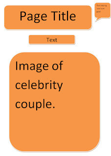
this is going to be my advice page, people are going to tell me their problems and im going to try to help as much i can. The text box at the bottom is for the contact number, email and website , so that people with problems are able to contaxt me and i can help them out.

This is the first page of my double page spread, this will include a large photo of the couple and a little opening lettign you know what the double page spread is about.

This is the second page of my double page spread and this is going to include an interveiw on the couple in the photo on the previous page.


This is my fourth page and this is going to include, pictures of 2 known celebrities, wearing the same clothes, and you can see which celebrity looks better.

Wednesday 19 October 2011

Assignment Bank 3: Print (Magazine) - Survey Results.

All of the people that answered this question said that they were interested in fashion magazines, 6/8 people said that they were interested in gossip magazines, 1 /8 said that they liked sport magazines and another  1 person said they were interested in food magazines.


4 out of the 8 people that answered this question said that they normally buy a magazine every month, 2 of the 8 people said that they buy a magazine every week , another person said that they buy a magazine every 2 weeks & 1 more person said that they buy a magazine every 3 weeks.


7/8 people that answered this question said that they usually pay around £2-£3 for a magazine and 4/8 said that they would usually spend around £1-£2.


This question was multiple choice (multiple answer ) , 7/8 people would like to see more fashion in magazines, 5/8 people said that they would like to see more of healthy eating in magazines, 5 people said that they would want to see more gossip in magazines, 4/8 people said they would like to see more celebrities in magazines, 1 person said that they would like to see more of sport in magazine and 3 people chose other, which means they would like to see more of something else in magazines.

This question, like the previous was multiple choice (multiple answer), 6 people said that they have purchased OK! In the past, 4 people said that they have purchased Reveal in the past, 4 people said that they have purchased heat in the past, 5 people have brought Now in the past and 3 people said that they have purchased Vogue before.

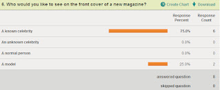
6 out of the 8 people that answered this question said that they would like to see a known celebrity on the front cover of a new magazine, but the other 2 people said that they would like to see a model on the front cover of a new magazine.

6 out of the 8 people that answered this question said that they would like to see the new magazine being purchased once a week; the other 2 out of 8 people said that they would like to see the new magazine purchased monthly.


This question was multiple answer, 1 person said that they would like to see stationary being purchased with the new magazine another person said they would like to see stickers being purchased with it. 5 people said that they would like to see nail polish being purchased with this new magazine, 3 people said that they would want lipstick or lip gloss to be purchased with the magazine, and 4 people said that they would like something else to be purchased with this new magazine.

Wednesday 12 October 2011

Assignment Bank 3: Print (Magazine) - Analysing A Two-Page Spread.

In this two page spread, the language that is used is very informal; this shows that the audience is aimed for teenagers. The language used makes the reader feel comfortable and brings a sort of connection with Tulisa. This is an important factor because doing this helps to bring attention to reader, and will make them want to move on. The interview comes across as a conversation between the interviewer and Tulisa. Non standard phrases such as ‘you can’t really’ have been used by Tulisa, which shows that Tulisa can be herself and don’t have to be professional. How is colour used In the two page spread, the colour that is used is very moderate, there’s not as much pink as there is on the front page therefore it doesn’t seem as loud as the front page. The way in which the text has been laid out on the page shows Tulisa’s slightly longer responses, and the questions being asked.  You can clearly see the interviewers questions as they are in bright pink, (this goes with the layout), and Tulisa’s answers as they are underneath the questions. Out of the ‘triple’ page spread, only one page is occupied by an image and the other 2 pages have smaller images and a lot of text. This shows the importance of this interview and why Tulisa was placed on the front cover. The tone that the magazine has used is very informal, it’s calm and relaxed. It allows the reader to connect with the interviewer and Tulisa (the interviewee) because the words used are clearly informal; it shows that the conversation is almost spontaneous because of the way Tulisa responds to the questions. The interviewer clearly gets a lot out of Tulisa so you wouldn’t have to have that much knowledge about Tulisa.

Wednesday 28 September 2011

Assignment Bank 3: Print (Magazine) - Analysing the contents page.

On the contents page the information is quite jumbled. The main story in the magazine is placed in the middle of the contents page. This is, like the cover page, about Tulisa Contostavlos and the X Factor, this time she is with her fellow judge Kelly Rowland. You can see clearly that this is the main story as it has the biggest image and the most text, and also the page number is the biggest one on the contents page. The rests of the page numbers are at the bottom left hand side; these also include a little text to tell you what that certain page includes. Also there is some more information about other stories included in the magazine and an image with each one, you able to tell quite clearly that they are also top stories as there page numbers are quite big too. This tells us that the magazine is going to be quite wild & messy and fun, this is because the contents page is very bold. There are promotional features included in the contents page, these are posters. There are 10 posters included somewhere in the magazine.  The logo/name of the magazine is placed at the top right hand corner of the contents page. It’s not very big but you are able to see it easily.

Assignment Bank 3: Print (Magazine) - Analysing a Magazine Cover.


We love pop, is a girly magazine, it mainly about gossip, fashion and boys.  The target audience for this magazine is pre teens and teenage girls. From the ages 12/13-16. Girls from this sort of age group are usually interested with fashion, boys and of course the latest hot gossip. The central image is an ‘X-Factor’ judge, and is also a member of ‘N Dubz’ Tulisa Contostavlos. She gives off a direct mode of address; she does this by staring directly at the camera. This will get the audience’s attention, and allows a connection to be made with the reader. It allows attracts the reader’s attention as she is a new judge on the X Factor, most people, including children, teenagers and adults enjoy this show and already know Tulisa because of her music. The anchorage text says ‘Tears, Strepsils and Tesco! The X Factor star keeps it real’. This implies that even thought she is a known celebrity and star in the UK, she does the same things as everyone else., she is an emotional person, as she ‘cries’, she gets ill and she shops in Tesco’s. this shows that she is your day to day person, she is no different from anyone else, the fame has not changed her. There aren’t any groups being represented on the cover of the magazine, also there are 3 small images to the bottom left of the magazine. The images include 3 women, who are young and dress well. This attracts young readers as they would aspire to be like these women. To the top left hand corner of the magazine, buzz words such as ‘brand new mag’ and towards the centre ‘world exclusive’ are used. This engages the reader as it is a cool new magazine with lots of new gossip. The design of the block title tells me that the magazine is defiantly aimed at young teenage girls, this is because the title is “we       pop”. This represents the magazine as bubbly and loud, just like teenage girls. The title of the magazine tells us that it is aimed at teenagers because of the images and language used. The colours used are quite bold, most teenage girls like the colour pink and this is why I think the layout used , to attract teenage girls. Also it’s a bold and bright colour, so it will catch the eye. The ‘puffs’ tell us that there is going to be a lot of teenage-related content in the magazine. This includes Justin Bieber, and he attracts a lot of teenage girls. There is also more text about boys being included in this magazine; also fashion is going to be involved in the mag. This tells me that the type of audience that the magazine expects to get is teenage girls.

Wednesday 31 August 2011

Assignment Bank 2: Film Promotion - Final Film Poster.

The poster conventions that I have used in my own poster are a tagline, the title of the movie, a critic review, a very eye catching image & the certificate rating. These would appeal to my target audience, as my eye catching image makes it clear that the movie is going to be a scary one.The representation that I have put together in my poster makes the movie seem interesting at first glance, because of the way the actress has been portrayed with the heavy makeup and the frightening face. The title of the movie also gives of the impression that this person has another side to her, as the W is crossed and replaced with a B.In my storyboard, the trailer conventions that I have presented are showing the company that has distributed the movie at the beginning, using appropriate sound for the trailer itself, showing the title of the movie, a narrative & some information about the movie at the end, such as when it will be released. My trailer would appeal to my target audience as I have used a narrative that gains the audience’s attention, due to the way the person is speaking and the background, which helps to bring a sense of horror into the actual trailer itself. I have also put some information at the end about the movie, so that people would be interested to go and see it, and usually there would be a release date but in mine I decided not to have that so that creates more attention and hopefully get people to atleast think about seeing the movie.


Thursday 23 June 2011

Assignment Bank 2: Film Promotion - Mock Up Poster.

Assignment Bank 2: Film Promotion - Brainstorm For Making A Film.

Assignment Bank 2: Film Promotion -Trailer Analysis

The typical codes and conventions of film trailers include key moments from the film which are not necessarily placed in the same order as the film and do not give away any crucial plot details. The title of the film is not usually put on screen until the end of the trailer, and that is followed by the release date of the film. Also the names of man starts are usually put on screen near the beginning of the trailer, this is important because it lets the audience know who to expect to see in the film, sometimes audiences decide to go and watch a film just because of the people starring in it. Usually the names of the director and the producer are included in the trailer, with a phrase of “from the director” or “from the makers of” then it will go on to say the other films that the directors have made. This is so that the audience can see what films the directors have previously made and how successful they were. On screen text gives important information about the film, including stars, producers, tagline, and title and release date. Also music is essential in trailers as it can suggest the genre, style and plot of the film.
The target audience for this film are teenagers aged 15+ and adults of all ages. The actress Courtney Cox is a unique selling point because she is a famous actress and this attracts the audience. In this trailer, it makes it obvious that it’s a horror/thriller movie, that there is going to be a killer and that all the people are suspected of being the killer. In the trailer the main star is visible and there is information about the director of the film. The narrators’ voice is over-used in this trailer; this is used to make an effect.
The camera shots help us understand the genre of the film because they are set from different angles. The lighting is quite dark but then some scenes are flashy.  The colours are also quite dark, this creates a scary atmosphere. The trailer also consists of sayings such as “don’t answer the phone”, the narrator will say this but it will also come up on the screen as it is being said then it will drip down in what looks like blood. The characters pictures flash up which is quite thrilling. Also the movements in the trailer are very quick which makes you feel jumpy.
I got a better idea about what the film is about by the trailer than by the poster, this is because the trailer gives you a lot more clues than the poster does and also you can actually seen bits of the film and have that bit or fear. Whereas with the poster it isn’t really scary and doesn’t make you jump like the trailer does. In the trailer you’re introduced to all the characters and you get to have an idea about the actual film and what there is to be expected from it. This makes the film more desirable to the audience because it gets you more interested and more engaged to actually go and see the film.

The advantages of using an internet trailer to promote a film over a poster campaign are that the film company gain attention from a larger audience. Also most people would rather watch a trailer so they can have a better idea about the film, if you see a movie poster in the street, you are most likely to walk past and not pay much attention even if you think that the film looks good, whereas on the internet, if you see a good fim trailer then you are most likely going to watch it.

Assignment Bank 2: Film Promotion - Poster Analysis


The typical codes and conventions of  film posters are; eye catching image/images e.g. the stars in the film, the title of the film, a tag line for the film, a catchy slogan, the names of the main people in the film, critic review, giving their comments and the production blurb. The audience expects to find the title, the names of the actors/actresses, a slogan, images of either the key people in the film or the main point of the film.The genre of this film is horror. I figured this out by the name of the film ‘scream’ sort of gives it away, also on the cover there is a image of a young girl that is extremely pale, she is half covering her mouth with her hands as if she has just seen something shocking/scary or if she is in shock, it looks like she is about to scream. Also the images of the other characters in the film are very blank, they hardly have any expression on their faces and they look very serious, it seems like one of them could be the killer/villain. Also they are all wearing black. The main colour on this poster is black; this shows that this film isn’t going to be a happy one as it is very dull coloured.The title has been designed this way because even though it is just plain, it stands out from the background because it is white. Also it is all in capital letters and the letter ‘m’ is slightly different. It has a point, which indicates something shape, such as a knife. So just by changing that one letter it gives you an idea about what the film is going to include. Therefore the audience can suspect that there is going to be a killer/villain and his weapon is going to either be a knife or something sharp.I think that people that enjoy scary, jumpy, frightening, thrilling movies would be interested in going to see this film. This is because you can tell it’s a horror film just by looking at the cover and also in the bottom left corner it says ‘the thrills start soon’ and it also says ‘clever hip and scary’. By using a famous actress on the cover, it engages more people to go and watch the film, and it also attracts attention. The film company that produced this film was ‘dimensional films’, they are an independent company, it was previously a part of ‘Miramax’. The film company placed the posters on billboards, on bus stops, on buses, on television, on other film adverts and also on magazines.

Thursday 24 March 2011

Assignment Bank 1: Advertising & Marketing - Advert + Explanation


This is my Final Advert.


The ideologies that are attached to my advert are affordable, high street, fashionable and trendy, so the buyers look good. New look’s prices aren’t too high, yet they’re not cheap. My target audience are young middleclass females, preferably trendies. My advert appeals to my target audience because the clothes in my advert are the sort of thing that young females would wear. One’s a very smart outfit, ones a classy black dress and the last picture is a casual but still dressy top, jeans and heels. In my advert, the needs that I have targeted from the Maslow’s hierarchy pyramid are self esteem, confidence and creativity. The persuasive techniques I have used in my advert is needs and fears and also personal appeal, this is because if the person purchases the clothes, then they will be seen as fashionable. The person in my advert is represented as a fashionista.

Thursday 17 March 2011

Tuesday 1 February 2011

Assignment Bank 1: Advertising & Marketing - Advert survey results

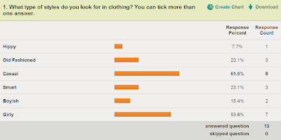
According to this question people prefer to buy, casual and girly clothes. Although out of 11 people, 3 of them like smart, and another 3 like old fashioned. 2/11 people like boyish clothes and 1/11 people like hippy styled clothes.

After looking at these results, I found out that the quantity is the most attraction for when buying a product. The second best is the actual clothes (the design, style). 2 people said that the popularity would attract them to buy the product and 1 person said that the price is what attracts them. 0 people said that the advert attracts them to buy a product.

The most popular brand, according to my survey, was new look. 9 out of 10 people have brought new look in the past. Also 8/10 people have brought h&m.  River island , top shop and Primark are all on the same popularity scale, with a result of 7/10 people. 4 people have brought clothes from next in the past and 3 people have brought from gap. 2/10 people have brought products from Lipsy and Warehouse. One person has not brought any of the products.
According to these results, 9/11 people have said that it depends on the type of advert, wether you can trust it or not. One of 11 people said yes the fully trust adverts, and one out of 11 people said they do not trust adverts.

When people go out on a casual shopping trip , the most common thing to buy is jeans, and the second most common thing to buy is a top. Shoes and jumpers are equally the third most common thing to buy. 7/11 people mostly buy socks + underwear on a casual shopping trip. 6 out of 11 people    buy jackets when they go out shopping. 4/11 people like buying coats.

The most common amount to spend on a casual top + jeans is £ 15-£25. The second most common is £25-£40. 2/11 people would spend £55+ on a casual top and jeans.